Reviewing & Choosing

Lesson with: Mark Ingham

This lesson was short and sweet. All that went down during this lesson was some simple feedback and reviews of our blogs and what extension do we want to do in terms of the lectures we’ve already had.

The feedback for my blog were minor things such as:

– Add widgets to my blog and have sections for different projects for my course

– Add some more images

– Begin to think of the design for my publication

All of the feedback above is useful and will allow me to finish of my publication a lot easier as well. I decided to take the ‘Grid System’ lecture as my base of what I will be writing about. My subject is ‘What is the psychology of the grid system?’ – This will be based around why specific shops are placed as they are in places like New York City and London, also why do grid systems have so much power in certain places like Schools, Restaurants and various other places. 

I will be updating the blog with more research and also any relative material that is beneficial for my essay.

Step 1 – Naming our essays

After our marking lecture with Mark Ingham, we had our second session which was based around splitting the class into two separate groups. I was in Group B which consisted of naming our essay set around what we will be choosing out of the different lectures we’ve attended. I wasn’t fully clued up on my choice as of yet but I have given it some thought and filtered all options until I got to my final two which were: 

– The photography lecture given by Mark Ingahm (Selfie approach)

– Grids lecture given by Monica (The psychology of shops being set out according to a grid system)

These were both interesting to me because it taps into different peoples approach to each topic and will allow me to improve on my audience analysis skills a bit more. 

After deciding what we want to go with, we started coming up with names for each of our chosen topics. I didn’t come up with a final name but hopefully after our next session I will have the perfect title, suitable for my choice.

Becoming the tutor

Lecture by: Mark Ingham

Our first lecture after our easter break was becoming the tutors. The content of this lecture consisted of looking at second year GMD students who have written an essay. we were split into 5 different groups which consisted of 4 – 7 people and we were each given (As a group) on of the 5 essays that Mark had printed off for us. My group received a essay called: “Crackin’ Barnet” which was based around hair cut and a bit about how it has been a popular trend throughout many years.

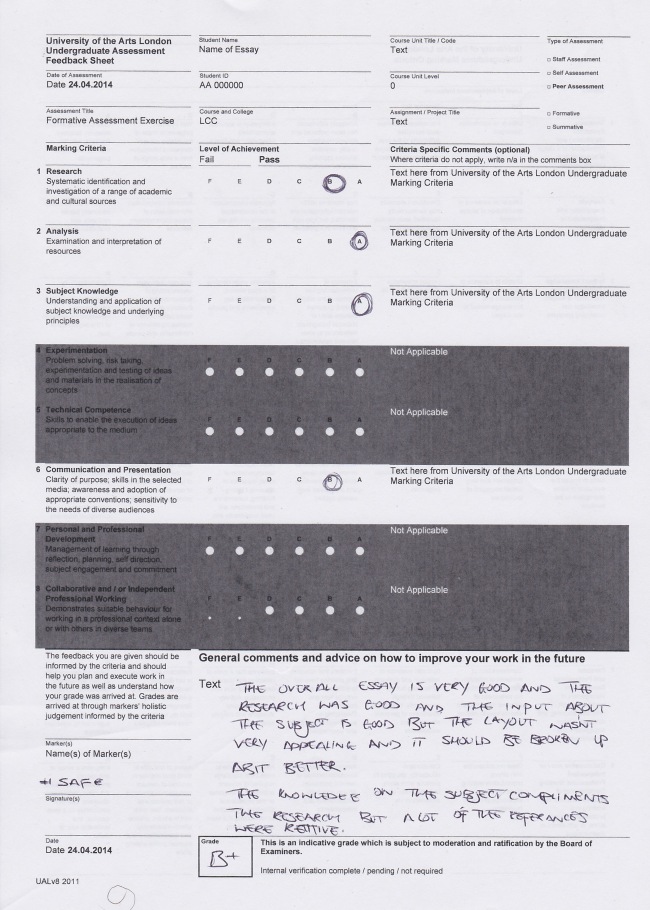
We were given 20 minutes to read through the paper individually and highlight any key points we thought may contribute to what gives the final grade. After we were finished with reading the paper, we then had to mark the essay using the same mark scheme that the lecturers use. I have scanned in my sheet which is filled out with the feedback I have given and what I graded it. My final grade was a B+ with some minor improvements for it to become an A. 


The feedback (Modified from the scan): “The overall essay, research, and input about the subject is good but the layout wasn’t very appealing and it should be broken up a bit better. The knowledge on the subject compliments the research but a lot of the references were repetitive.” – I think if the essay was laid out a bit better and had quoted some different phrases, it would have achieved a better grade. I enjoyed this session as it allowed me to see where I might go wrong in the future.

Image

Taken directly from: Lucy Jennings URL: http://lucyjennings.myblog.arts.ac.uk

As recommended by my tutor, I visited the GRAD to see the Kino/Film: Soviet Posters of the Silent Screen exhibition with my reluctant partner Oscar. The exhibit examined the golden age of Soviet film posters, and even hosted projections of some of the films alongside their corresponding posters. Most of the work featured was from the 20’s, around the time of constructivism, a style that is clearly present in the works displayed. What interested me was the stark difference between the films and the posters. Film making at the time had obvious limitations when it came to colour and quality, juxtaposed with the crisp, clear, colourful printed posters (which still retain their vibrancy after almost 100 years) it shows a creative freedom and artistic licence for the designer. Film posters and film share a different relationship today, I feel like todays posters almost lack creative input and display characters and pallets exactly as they are depicted on screen, there is still freedom of type I suppose, but the striking and inventive imagery of the Kino Film poster is lost. The posters were outlets for creative freedom and fantasy, images chopped, rearranged and printed in bright colours like a surrealist collage.

Type is also another interesting component to this exhibition, as Monika Parrinder mentioned in her lecture on systems and grids, there is certainly a clear use of type as image in the Soviet posters, examples of type being integrated into image and breaking the rules of horizontal baselines. The curation of this exhibition was also intriguing. It’s actually quite a small collection of work but the space was used well, in a clean, minimal way, which matched the smooth lines, block colours and flat textures of the posters well. The exhibition space is unlit and dark, with spotlights on the works which certainly gives it a “night at the movies” feel. The walls were painted a dark, gun metal grey which, given my recent obsession with using grey in my work, I thoroughly approved of.

_______________

This entry was directly from Lucy (Class member) who attended the exhibition as I couldn’t. Simple repost.

Serious Business – 2ND YEAR OPTIONS

This lecture was from Mark Ingham and was about our second year choices for my course. He broke down some of the options that are available and the content of them. I’m required to choose two options that are based around Art and design. Whilst running through all 32 of the options I made notes about some of the choices that sounded most interesting and that will help me to improve my knowledge on some fields that I am looking to learn more about. I made a list of the ones that interested me most with a minor breakdown on what it is about but some of the names are listed for me to look deeper into that specific choice. Information below:

Film studies – Explore films and development of old style and new Hollywood films also looks into independent, budgeted and high quality films

Zeros ones and inky books – Which is about the digital world and how things are put together such as eBooks, blogs, apps etc. and also about publication

Re-writing Re-Design – Which is mainly about how to improve on your writing skills in general

FBI – This course relates fashion body and identity which is also based on peoples own unique style and identity to other people

Music Cultures – Focuses on relations that music has with different mediums like design, taste, dance and other visuals

Dance – 

Info head – 

Experienced centered design – 

Design in a complex world – What technology is doing for how we want to live and where it is going. How you can make a better place through design

Introduction to photography – Series of lectures, which will be based around how photography has started, and what started it

urban encounters – Concerned with design in the city and how urban context is applied through design and used in real spaces however how it is valued

Green persuasion – Finding out about why green is so important and how it is shown into perspective however you must look at what green actually is

Living spaces – Looking at spaces where I am living = Schools, houses, estates and simply look at what’s happening in the area

The choices above are the ones that stood out most for me but I already had my mind set on my top 3. They were:

–        Fashion Body Identity (First choice)

–        Designing For A Complex World (Second choice)

–        Green Persuasion (Reserve choice option)

I went with these 3 as I like the path that some of these subjects are going in todays world. I wanted to enhance my knowledge on a lot of the ground that these choices cover and with the reserve option being what I chose, I feel that I can design something that may be used at a later date and give me the opportunity to work with other designers to produce work in the future as well.

After picking our options, we discussed with our peers which one we wanted to do most and why which was followed by explaining our most interesting picks to Mark to get some feedback. We haven’t been told who is going to be the tutor of what class but we still have the option to re-visit old lecturers to get help and feedback for our assignments.
Defining ‘TYPE’

Another lecture given by somebody different and this time it was by JP Harnett. This lecture was based around ‘Typography’, which is a forever spoken about topic since starting Graphic Media Design and is all I think about when designing. Lacking on knowledge around this subject, this lecture was crucial and benefits my design work throughout this year. I have gained a fair amount of knowledge but not as much as I’d like to so every bit of information helps.

During the first part of the lecture, JP gave a few definitions which were obvious but not laid out so simply. This was: “Typography is concerned with the determination of the appearance of the printed page” – This statement was simple and straight to the point as type is vital and plays a crucial role because it sets different aspects of design such as: page layout with its size which leads onto column width then alignment and various other things.

Another definition that JP delivered was “Typography is writing with prefabricated letters” – This is basically defining what typography is often seen as. Typography is a medium in art and design that changes depending on the practice. Some of these key and minor factors opens up the realm of typography a little better and allows me to treat it differently.

FOURTH LECTURE: COMMUNICATION

Different syllables!

Different syllables!

This lecture seemed to be the quickest and was less productive in comparison to the previous lectures. I found that it was based a lot more on communicating and building up a following also communicating with specific people, twitters, blogs and even lecturers. To start it off we had to tweet about any previous lecture:

Quick tweet about the lecture from last week –

“Grids can be found and seen within everything! The good things about using grids are that they can show organisation perfection of layout and a good designs eye.”

After that we then had to type up a draft for an email which we were then suggested to send off to our lecturer about our favourite lecture so far:
Email – My Lecturer

The lecture about photography has been, by far the most interesting due to the access into the insight of different photographers. Seeing how they go about producing their work and taking specific photos in addition to how they go about the feeling and emotion that goes into it. One part of the lecture that really stood out for me was the ‘Difference between a selfie and a self portrait’ // the method on how to express a person through a photo and I am thinking about doing a extension on this specific project.

To wrap it up we had to come up with a ‘Haiku’ which could be about ANYTHING! however this was a lot harder then you might think as it also had to make sense in addition to it being relative to what may be currently occurring in your life. A Haiku consists of 3 lines and 5 syllables on the first and last line and 7 on the second. My Haiku is below:

HAIKU –

3 LINES

5 SYLLABLES

7 –

5 –

I NEED SOME MORE SLEEP

THIS PHOTOGRAPHY IS DEEP

I CAN’T EVEN TWEET

Our Haiku was also to be sent off to our lecturer and tweeted if we have twitter.

“Publish and/or be Damned?”

“Publish and/or be Damned?”

“Publish and/or be Damned?”

eleni-demetriou-gamswen

At the end of this course of lectures, seminars, exhibition visits and workshops you have to produce a publication, which could be in the form of a pamphlet, or blog/website, or newspaper, or catalogue, or magazine, or zine, that is a chronicle of these lectures, seminars and workshops, that will be given throughout term 2.  This will mean you will have to take notes on every session and upload them to your blog weekly, so you can then use them to write up your ‘publication’. You will also have relevant reading each week that will enhance your understanding of the theme of the session and will help you write an articulate ‘article’.

Each lecture, seminar or workshop will have its own section, chapter, page or pages dedicated to it. As in any publication these will be your individual sections/articles and will be fully illustrated/captioned and cited…

View original post 274 more words

THIRD LECTURE: GRIDS…EVERYWHERE!

photo-5

Our third lecture was based on ‘Grids’ and how they work. This lecture was a lot more informative and insightful into how often they’re used. Throughout the lecture I learned that some themes that utilise grid systems are more common then I’d thought. These themes were:

– The City: New York & London

– Pages

– Text

We were also given some key terms like:

– Rational/irrational

– Mechanisation/Digital

– Homogenous/Heterogenous

– Modern/Postmodern

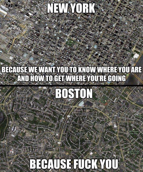
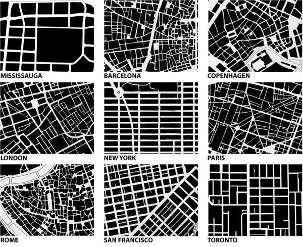
All of these words were broken down for us to understand a lot more easier. Shortly after we went into how grids are used in some of the themes listed above. ‘GRIDS’ A clear example is the birds eye view on google maps. Seeing that from that particular view will show you a little (Depending where you are looking) if not a lot of grids however we learnt that some grids are also classed as ‘Organic Design’ which means the people that live in that area are free and the place can grow by trade whereas some grids are classed as ‘Master Plans’ which means the map has been designed for people to follow a specific route and even maintain their “Shopping Spree” down NYC!

Grids are designed to be systematic which makes people do certain things that the layout might want them to do.

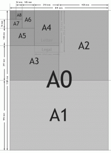
Moving onto the paper using grid systems: ‘A’ paper sizes are from rome and the example follow a “Shell” – Which is a spiral.

Having using grids in almost everything can cause a lot of things to repeat itself as there is nothing new. For example peoples lives and tasks then become sectioned and put into groups thanks to do things repetitively.

This lead onto ‘Perspective’ as for the people who followed suit and maintained that repetitive lifestyle due to the grid system then taking part of their actual organisation with life, those more organised and sophisticated people would wear suits which then automatically was thought to portray organisation.

Going back to grids and design – Harry Beck had designed the ‘London Underground Map’ and continued redesigning for 20 Years. He made it simple to read and added coloured lines for identification and being an engineer himself helped him make it a bit easier to understand however he found it difficult to make the transition from old design to new, modern design.

‘Design back in the day had no direction. Visual design was free and hundreds of typefaces are used.’

SIDE NOTES: Up is positive and Down is negative. No images were used back in 1900’s and the images came from shapes and colours.

Info on different grids in action.

Info on different grids in action.

Grids are even in some of the more basic things we seem to use day in and day out such as paper! Paper is where the grid system originated from using the spiral according to Egyptians.
Paper sizes.

http://www.dimensionsinfo.com/paper-size-chart/

SECOND LECTURE: WRITING USING SENSES

This lecture was based around writing down things daily whether it has some use or not but just to get into the habit of doing so. We started off by writing anything, basically the first things that come to mind however I linked it to something that my day consisted of and what we have learned in the previous lecture. What we wrote wasn’t being stored so it didn’t mean anything. We then got in pairs and spoke about what we had just done and then was given another task to link words we have learned that day to our personal lives. Mine were:

– Stillness: This is the name of my primary school, which hosted some of my best memories.

– Frankfurt: Visiting Germany then making a trip to Frankfurt.

– Barrack Obama: Always triggers memories of when he became president.

After that we were to reflect on what we wrote and then link a chosen word to our senses:

“I remember the sight of other classmates running around, playing tag, pat-ball and stuck in the mud. The sound of the shouting and screaming kids not wanting to be caught as they ran wildly playing not wanting to become the chaser in tag. The taste of the over salted potatoes and sweetness of the cake and custard. I remember the feel of the concrete floor and the wooden benches that we would sit on to have our lunch. They are but fragments of the memories from the word ‘Stillness’.”

That task was to link our senses to one of the words that we remembered throughout the day or during the previous lecture and ‘Stillness’ was from the human ‘clamp’ which held people still whilst taking picture and the paragraph above is what came to mind when thinking of stillness.

To keep up with our daily writing we were told to write down 5 of our favourite blogs. My favourite 5 are:

– Graphicgravity

– Fabienneayton

– ttdrunk

– tyronelebon

– diab0und

All having some relation to different graphical mediums, they allow me to have some insight to their work.